Wednesday 5 December 2012

The Fastest Art work ever!!


Designed by French artist Bernar Venet, the bespoke model features a two-tone exterior with a dark brown rear end and orange mathematical formulas at the front.
The unique styling carries over to the interior as it has two-tone leather upholstery and special door pads with contrasting orange mathematics. There's also an embroidered Bernar Venet signature and a small metal sculpture between the seats.
Like the standard Grand Sport, the Venet is powered by a quad-turbocharged W16 engine that produces 1001 HP (736 kW) and 1250 Nm (922 lb-ft) of torque. It enables the model to accelerate from 0-100 km/h in 2.5 seconds and hit a top speed of 407 km/h (252 mph). 

Bugatti did a great job again in the Veyron, this is what a Veyron should look like. Just like the idea of this, and I think this should be the fast production art work ever made. The Veyron got new style!!!

Bugatti Veyron Grand Sport Venet

This is definitely a good place for a watch advertisement!


This is the latest and the most interesting advertisement from IWC I have ever seen. This advertisement I think is the new ideas for advertising industry, thing out of the box and feel what people do in their daily life. I also think watches is definitely the best product to put in this place, I can't think of another product which suit better than a watch. Nice one, but IWC needs to remember change to a new watch whenever they design a new one, If they not, this will become outdated. 

The Emirates!


Every different airlines have their own unique advertisement, not just an airplane in the background all the time. In this Emirates, I think the proposition for this airport is really good and it really suits the airline itself. However, I found think this advertisement it not interesting and attractive enough as a consumer point of view. Firstly, I want to talk about the colour of this advertisement, it looks really cold and lonely. And it didn't stand out the airline, not even the logo. Compare with the competitor of Emirates's advertisement such as Cathay Pacific or the KLM Airline, this advertisement seems bit bored. 

BMW latest creation.

 OFFICIAL: BMW 4-Series Coupe Concept revealed - 46 high-res photos

Looking production-ready, the two-door coupe will make its public debut next month in Detroit. This is basically a three-door version of the 3-Series sedan but comes with several design tweaks that make it look sporty, yet elegant at the same time. BMW installed a set of exclusive 20-inch light alloy wheels featuring a three-dimensional multi-spoke design that add to the car's sporty look. At the front we notice the hexagonal full LED headlights and the larger air intake in the front apron. The sloping roofline creates a natural transition into the rear, while the side windows help the slim and stretched theme.Moving inside the cabin, it's the traditional BMW driver-focused layout with the vital controls located ergonomically around the driver. Colors and material design have been developed by BMW Individual, including the two-tone Black and Schiaparelli Brown trim and light contrasting stitching.
What a nice car from BMW. if people don't like the looks of the BMW, they hate it. And some say BMW is a driver's car, in my opinion I think this time BMW did such a great job in their latest model which really surprise me. Nice one BMW!!!

Tuesday 4 December 2012

BMW, what have you done to the Mini?


Although personally I don't really like this model of Mini which is the Mini Clubman. I think its look a small Ford Van rather than a Mini, from the size of this car I don't think the brand (Mini) really suit it. Anyway I want to talk about the advertisement concept of this car, I think it is a really good place to present this car. An airport is where people traveling around the world which a big luggage. This show the Mini Clubman can curry all size of luggage easily, its efficient like the luggage bell. And the design of this advertisement is 3D, it makes the whole advertising and the product looks more attractive and interesting. But I still don't really like the design of the Mini Clubman.   

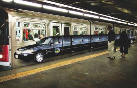
The Limo!!

guerrilla art marketing subway limo

The Limousine car idea is original came from America, the American being the clubs and parties style into a car. The special about limousine is a luxury, partying and long automobiles. The reason why this advertisement use the Lincoln limousine is because the model from Lincoln is the first model of car which custom to a limousine from early 70s. The similar between a limousine and the underground a long transport. And the biggest different between these two is limousine is the transport which is very luxury and expensive to take people won't use that as their daily transportation escept for those million or billionaires, and the underground what people take in their daily life because its cheap and it goes everywhere especially in New York. What a huge contrast in this adverts, interesting. 

The biggest competitor for the Iphone


Here's the Samsung Galaxy S III, some say it is the biggest competitor for the iphone. Part of the reason why Samsung is becoming so success right now is because of their adverts, and how Samsung present their latest phone model. I think advertisement is the first media and information for all the customer to feel about their products. This adverts show how different react from the new product by their wears and dressing i.e. some characters in the adverts dress really casual, some dress smart with a shirt and some other who dress like an artist. In this adverts Samsung really care about the detail and the consumer's daily life which is good. So I think a good adverts with a great match. 

F1 USA!!!


Here's the poster compare the two greatest sports car event in America which are the Nascar and the Formula 1. The America had stopped the F1 event few years ago for some reason, few years later the new F1 track had built in Austin America, which is a good new for some F1 fans in America and around the world. However, in this news said about the Nascar is still the most popular car event in the world. At some point, I don't quite agree with this, because I know the Nascar company had been running low budget and not enough car fans involving the event. In the other side, the F1 ticket always been out of order and also the sponsorship on F1 is much more the Nascar. In my opinion, I still thinks the F1 is better the Nascar.

Another way to promote a Mini

The Fastest Mini ever made!!

Raceteam Schirra MINI on Nürburgring Nordschleife
The impression of Mini for me is cheap, portable, small and its goes around the city easily. I can't believe that a mini can perform that on the track. This shows this Mini can compare with other sports cars i.e. BMW or Porsche instead of the same level hatchback car like the Volkswagen Golf or the Audi A3. Good effort Mini!!
!

Adidas


This is how Adidas using the olympics athletics to promote its brand. To be honest I think some other sports brand have using the athletics to promote their brand. The special about this adverts is the passion of this athletics, he achieve what he want and his dream which is earn the Olympics gold metals. What he have to say is "Take the Gold" or "Earn the Gold". 

Scottish SPCA


Whenever I look some advertisement which have a poor dog, it makes me missing my two doggies at home and wants to see them as soon as I can. Especially the advertisement like SPCA, it makes me want to help those dogs from the photo to get out living in a poor condition. Firstly, I want to talk about the colour of this advertisement. Red colour makes people feel sad, lonely, danger and anger. The black colour in the background represent their situation is dark, and looking for help especially with a dog. Red and white means the colour of ambulance, this means if they still don't get help, they might die. Secondly, the thin and dirty dog in this advertisement. This show how hungry and the bad position, if they put a healthy and clean dog in this advertisement, this won't shows how bad the dog need to help. 
A really meaningful adverts. 

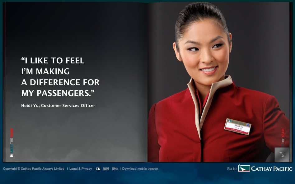
Cathay Pacific


I always that Cathay Pacific this airline give people a great services, no matter on the plane or even in the Cathay Pacific Lounge in the airport around the world. When I first seen this advertisement, I think they really made a good effort in the proposition it really suit the airline itself as I experience the services. Also the model Heidi Yu really shows her passion about the airline from her face. In my opinion, I think the design of this advertisement looks nice and clean, got the main colour of the airline which are red, blue and white. Look good, and that's how Cathay Pacific become so success this the airline industry in Hong Kong.    

Fiat # Hot models.


This adverts had been describe as the Topless Fiat Commercial. I think the main reason is because they using a really fit and pretty model in the adverts. I always think that a nice or famous in a commercial will stand out more. This will first attract men's attention first because of the looks of the model, but don't forget about the car because buying a new car is also some the men's main hobbies for those who have a good disposable income. Good job Fiat, you did a great job again instead of designing this fabulous car.  

International Batteries.


This is the images represent "international", some kids with different countries. I really like the idea of this adverts using all the kid models instead of adults, because the kids really shows a real happy face not the adults acting they happy and excited. This adverts in came from a battery company called Chung Pak Ltd. the reason that this company making this adverts is because they want to make their sales in different countries around the world that why they using different kid. Some of the kids represent their country i.e. Chinese, American and Afica. Really nice and attractive adverts. 

Green life!

 
I think this is a great example of an advertisment to show how people living in a green and better environment in their daily life. As most people might think and knows that one of the trands now is green energy and re-cycling, so that their next generations can live in a better environment. This adverts is about the latest product of no mercury added green battery by a company called Chung Pak. The green colour background with the models act and how she enjoy the green environment. I think the colour and place in the background is really match the proposition of the product. They really did a great job.


New office


What a great working enviornment for the workers in the company. It a boss of the company make this new office for the workers will be a great motivation for the workers, an aquarium in between the work mate. The reason why I say this is a great motivation is because loads of people who working the in office for the whole think, it is such a boring and sad enviornment in the office. Because they have the face fours walls all the time, what they face all time in the office are loads of papers work and a computer. If a company make this aquarium on the table in the office, they will not feeling that tired and boring, because something moving in front of them. They can see something else instead of just facing the white wall all day long.

Southern Comfort, relaxing!!


The best thing which attract me the best in a drinks adverts is how the actor enjoy the drink. Their face, passion, feeling and act to the drinks which make a lot of people want to buy that and enjoy it together. Personally I think an old man act in an adverts is quite boring and makes me want to sleep. However, not this adverts the reason is I a person who really enjoy drinking with my mates. Secondly, I really like the combines with the charator and place in the background is really match. Love it!